The web world moves fast in the minds of surfers and yesterdays site standards will be the laughing stock of tomorrow. It’s quite understandable that most companies would prefer not to scrap their websites every year and build everything from scratch based on the current trends. Like changing every square box to rounded corners, just to look more 2.0-ish. After all, web projects are most probably not getting any cheaper, with the constant scope creep and increasing number of must-have features for any corporate site.
Nevertheless, some changes in the behaviour and assumptions of the web audience are so profound that you shouldn’t really even dare to assume that you have an option whether to comply with them or not. One such assumption is the ability to search. The sad fact of the matter is that a huge portion of casual surfers don’t even know what is a browser, since all they do is search through Google, even for the URL to a site they want to visit. Hell, if it wasn’t for the smart address bar in Firefox that let’s me access pages from my browser history so painlessly, even I might be lazy enough to just google the name, instead of wondering about .com/.net/.fi.
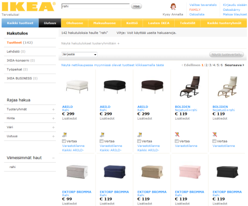
In the current climate, you are then pretty safe to assume that most users enter your site as a result of a search (hence the popularity of SEO). What happens then after they reach your site? Well, unless they were lucky enough to land on the exact right page, I bet they’d prefer to do a search on the content of the site. The absolute quickes way to information is a search box, or at least it should be, when the search is working like Google is. Even if the results are not quite as well organized, it’s still useful when the visitor is looking for some more rare keyword.
How can it then be that in 2009 there is still an incredibly large portion of midsize retailer sites that are lacking the search functionality altogether? Take this one example: Koti-Idea furniture store.

There are 2 tempting boxes in the top right corner, but that turn’s out to be the account login, so most visitors will not be interested on that. There’s a shopping basket on the bottom left, but I don’t see anything to add to it yet. There’s even an application (IE only) for designing your own bookcases or sofas, which sounds all fine and dandy. However, I can’t get to the product which I have in my mind, since there’s no box to type in the name and click “search”. Instead, I would need to start thinking in categories and navigating menus. How much fun will it be to start guessing the taxonomy adopted for this particular store, browsing through one category after another, just in case you would run into the product you are, well, searching for.
Upon my quest for new furniture I ran into several sites that lacked any means of searching for the products that were hidden somewhere deep in the folder structure. Sure, I could have always gone back to Google and do an advanced search for hits from that particular site. In the non-eCommerce world that would have been roughly the equivalent of walking into a store, then going back home and returning with a credit card, just because the cashier didn’t accept cash payment. Now wouldn’t you just rather walk to the store next door instead?


0 Responses
Stay in touch with the conversation, subscribe to the RSS feed for comments on this post.