Skip to content


Everything is still email

A few weeks back I discovered Posterous, which is a tumblelog service (think Tumblr) built around the concept of email as the UI. Want to create an account? Send an email to post@posterous.com and you’ll get one. Want to create a blog post? Write it in an email and send it again to post@posterous.com and it’ll get published. Sure, you can post stuff through the web interface, if you really must. But the service makes a serious effort in trying to do the best job possible in figuring out how the contents of an email message should be rendered, in terms of attached images, youtube links and the likes. Even with it’s shortcomings, I feel the user experience is actually superior to my long time favourite blogging platform WordPress. Forget about tweaking your posts, just email ’em.

Facebook has such bad usability all-around that nowadays I tend to only navigate to Bejeweled Blitz and follow status updates throug TweetDeck. When do I then go to Facebook? When I get an email from the service, telling me that someone has commented my stuff or sent me a message. Rumor has it that Facebook is in fact working on developing a full webmail service, where you could receive messages to your vanityurl@facebook.com.

Google is the current king of email with Gmail. Nothing comes close, except the threat of people’s increasing usage of media other than traditional email for their messaging needs. Google isn’t standing still, instead they are trying to incorporate more and more social features into Gmail, like the recent announcement of Google Buzz. And where does the Buzz exist in terms of UI? In Gmail. Where do the comments to your status updates come to? Your inbox. ¡Viva la email revolución!

Google Wave is trying to go beyond email, but the current preview version (notice: not even beta!) has one severe limitation: it doesn’t act like webmail, meaning you can’t actually send emails to your @wave.com address. Yeah, what do you call and @address that’s not an email address? It’s hard to see the adoption rate picking up until Wave embraces email.
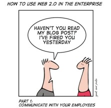
Numerous Enterprise 2.0 application providers are keeping themselves busy by building wonderful collaboration environments for office workers, to make them more productive in their daily tasks and teamwork. But still they can’t come anywhere near email. Everyone uses it and it is the lowest common denominator that every information worker loves to hate, but couldn’t live without. As Jacob Uckelson writes about the enterprise collaboration paradox:

So even though almost every enterprise has special purpose solutions available for collaboration and process management, good old e-mail always ends up being the primary method for both collaboration and processes in the enterprise. This can be called the “enterprise collaboration and process paradox,” and is the “dirty little secret” of both collaboration and process execution in the enterprise. Realistically, there doesn’t seem to be any way to displace e-mail as the king of collaboration and processes

Everybody used to be stressed about the growing amount of spam email a few years back. Today the rate of spam that avoids my junk email filters is probably 0,001%. Email used to be confined into desktop applications like Eudora or the omnipresent Outlook. Now it’s in the browser and in your mobile phone, meaning in practice everywhere.

Email has come a long way and it’s not going away anytime soon. It’s more likely that we’ll just be getting more of it.


Posted in Web.

Tagged with , , , , .


Tune of the week: Shaun Baker – Give!

Corny lyrics about saving the world are usually not a big turn-on for me, but here’s the rare exception to the rule. Just sit back, relax and give the world a reason to turn.

Posted in Music.

Tagged with , .


Tune of the week: Edward Maya – Stereo Love

A summer chillout track in the middle of one of the coldest winters in years doesn’t sound like the most likely Euro hit, but it’s hard to deny the chart positions that Stereo Love has been gaining.

Posted in Music.

Tagged with , .


iTunes Store is becoming the Altavista of music

I’ve never owned an iPod (sticking to my Zen) or an iPhone (using the dying breed of WinMo phones). As a result, I’ve never been forced to use iTunes. I have, however, used it a fair bit for purchasing music online. Compared to the other digital music stores out there, I always felt the customer experience that Apple has managed to deliver through iTunes has been quite exceptional, even without the hardware integration/lock-in factor. Of course the barganing power of Apple has helped them in building up a very competitive catalog of tracks for sale, which helps with the experience.

Recently I haven’t been touching iTunes much at all, since my online music consumpion has transformed from files to streaming, thanks to Spotify. Many times there are still tracks that are not available through the Spotify subscription service, which is when I turn to see if iTunes is providing them available for purchase. Much to my surprise, I’ve started to increasingly dislike the iTunes experience. Looking at the results from the new 2010 Customer Experience Index by Forrester, it looks like I’m not the only one.

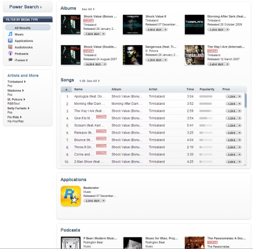
Let’s compare what happens when I search for an artists in both services. iTunes goes first:

With the current version of iTunes 9, there’s just too much going on in the user interface. Even with the UI chrome excluded from the picture, there’s still way too many items fighting over my attention. Furthermore, I don’t get the immediate Google Experience ™, where the first search result is big and bold, waiting to be clicked. In iTunes the items are too small and don’t appear clickable, maybe because there’s just so much I could click on. Overall, the navigation just feels like too much work, not enough fun.

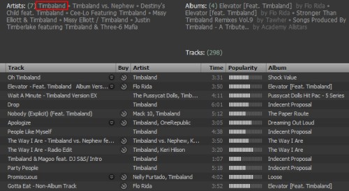
What about in Spotify then:

Lots of small text here as well, but it’s a lot more bearable, since the structure is so clear. I know the purpose of each UI element and they are grouped in a logical manner, so that none of the information I’m not interested in feels like any kind of distraction. Even without any previous experience of using the application, I think I would be quite at home in navigating in Spotify, since it follows the univesal language of audio library software. What’s funny is that I think much of that language has evolved from the most popular audio library out there: iTunes.

Why is iTunes starting to become more cluttered? Why is it going down the path of Altavista, which used to be the top search engine of its time, before transforming into a messy portal with too much ads and features going on, then consequently losign the game to Google? My theory is that both iTunes and Altavista have (or had, in the case of AV) the same problem, which is the need to be constantly selling to the user. iTunes Store does not make any money until the user clicks “buy”, and it needs to achieve this same behaviour time and time again. In a similar fashion, the portal fever that Altavista was infected with consisted of presenting as many ad banners to the visitor as possible, whereas Google cleared away the clutter and developed a way to show only relevant text ads in predetermined sections.

The Spotify model doesn’t have the hard sell built into it. Its model lures in new users with free accounts, to explore the simple functionaliy built over the vast library of music available for streaming by just clicking on it, building up an engaging first experience of the service. Sure, the users are greeted with audio ads between tracks, unless they purchase the premium account. However, that’s a handicap that you can disable with giving them money, and I’m betting people can easily understand the trade-off there. In iTunes Store there is no subscription service that would make the catalog browsing free from the hard sell. Not until Apple starts offering the similar streaming scheme as Spotify, that is.

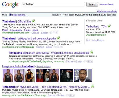
Let’s take one final look at another UI for searching a particular artist. With the introduction of Google Music giving some glimpse of things to come, I’m betting that the future UI design patterns for audio libraries will most likely be coming from the masters of search.

Posted in Music, Tech, Web.

Tagged with , , , , .